I’ve been spending a lot of time in Claude lately, building skills for marketing work that I used to just do manually every time. A few of them turned out genuinely useful, so I figured I’d share what they actually do.
The general idea is pretty simple: a lot of marketing judgment is repeatable. You know how to do a positioning analysis, you know what bad AI writing looks like, you know that a feature launch needs different messaging on different surfaces. But every time you do it you’re rebuilding from scratch. I started building Claude skills that codify the repeatable parts so my time goes to the decisions that actually need a human. Here are three from recent work.
Finding white space for a language-learning app
2 months ago I was working with a solo founder in Singapore who’d been building a note-taking app for English language learners, about 2,000 users mostly from language learning communities on Telegram and WhatsApp.
His product lets you capture vocabulary and grammar patterns from your daily life and uses AI to organize and resurface them based on your gaps, so it’s fundamentally different from a flashcard tool. But his landing page said “AI-powered vocabulary notebook,” which put him right in the same bucket as Anki, Quizlet, and every other spaced-repetition app out there.
The problem was that standard competitive frameworks wouldn’t actually surface his differentiation. If you map language learning products on features vs. price, or on a category grid by market segment, his product lands in “flashcard/spaced-repetition” by default because that’s where the surface description puts it.
So I built a Claude skill that pulls competitor homepage copy, about pages, and app store descriptions and runs them through a positioning analysis on four dimensions I designed for this specific space: ICP (test-prepper vs. immersion learner vs. casual), learning model (curriculum-driven vs. self-directed vs. ambient), content source (pre-built library vs. user-generated vs. real-world capture), and primary use pattern (dedicated study sessions vs. woven into daily life).
When I ran the competitor set through this framework the gap was pretty much immediate. Every major player clusters around pre-built content and dedicated study sessions. Nobody positions around building a personal knowledge base from real encounters, and once you see it through the right lens it’s kind of obvious, which is the whole point of designing the analysis well.
The skill produced a positioning map and three statements taking different angles on that gap:
One framed around the workflow (“capture what you actually encounter, not what a course decides you should learn”)
Another around learner identity (“for people who learn English by living in it, not studying for a test”)
The last one around the output (“your English is in your conversations, your reading, your daily life, this organizes all of it”)
He went with something close to the identity framing, which made sense because when your differentiation is in the user’s relationship to the tool rather than a feature list, identity-level positioning tends to land harder than benefit-level messaging.
The skill itself is straightforward: fetch copy, run it through structured prompts, produce a map. The value is in how the analysis is designed, which dimensions and comparisons actually make the differentiation visible. That’s the judgment layer. The skill just makes it repeatable so I’m not rebuilding it from scratch every time a founder comes to me with the same “I can’t explain why we’re different” problem.
Catching what AI-generated content actually sounds like
Here’s something that genuinely bothers me: so many people use AI to draft content, skim it once, think “looks good” and just publish. The grammar is correct and the structure makes sense but something feels off because there’s a visible template underneath it all.
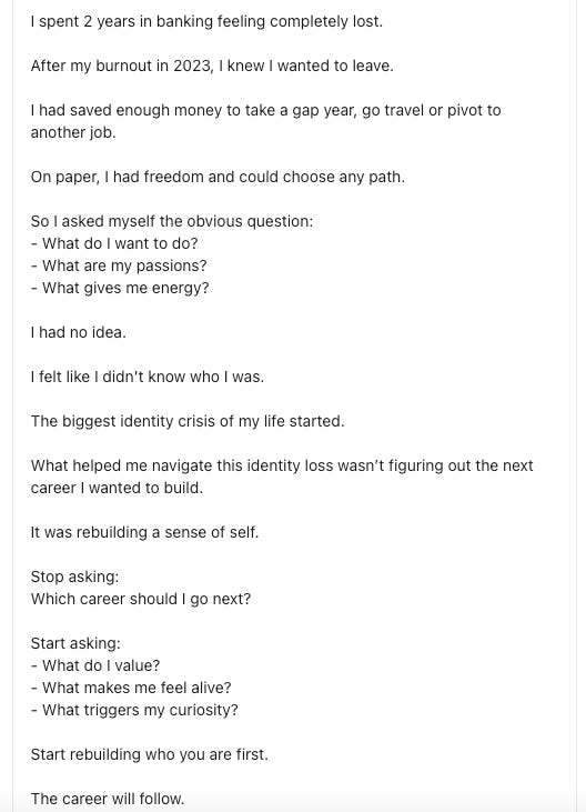
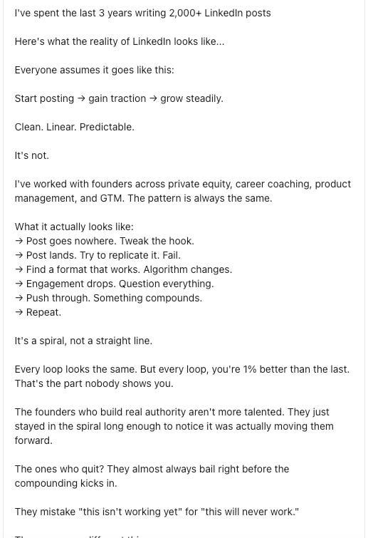
These two posts are from different people, different topics, different industries, but they read like they came from the same writer. The rhythm is identical: short sentence, short sentence, dramatic pivot, “it’s not X, it’s Y,” three-part list where the third item is the punchline, line break, repeat. Your audience is developing the same pattern recognition whether they realize it or not.
I built a Claude skill that diagnoses this systematically. It takes a draft and flags specific patterns at the line level: rhetorical inversions (the “it’s not X, it’s Y” structure, especially when it shows up more than once), sentence stacking (three or more consecutive short declaratives with no connective tissue), generic transitions (“That said,” “Here’s the thing,” “Let’s break this down”), and abstraction without grounding (claims with no concrete reference, no number, no specific scenario attached). The skill produces a flagged version of the draft with annotations, a pattern frequency count, and a rewrite of the worst sections.
These diagnostic categories aren’t arbitrary style preferences. Each one maps to something that kills reader trust in a specific way. Rhetorical inversions become a problem when they repeat because the repetition is what triggers the “this was generated” feeling. Sentence stacking reads as robotic because real thinking connects ideas rather than laying them out in parallel. The skill doesn’t just flag problems, it explains why each pattern matters for the audience you’re writing for.
About three months in, it catches roughly 85% of what I’d catch in a manual edit. The remaining 15% is still judgment I can’t fully codify: tone mismatches, moments where the writing is technically clean but just doesn’t sound like something a real person would say in conversation. That part is still manual. But the 85% means my editing time goes to voice and substance instead of pattern-level cleanup, which I’m pretty happy with.
Coordinating a feature launch across three surfaces
There’s a personal finance app in Singapore I worked with earlier this year, Seed-stage with about 10 people, growing organically through Instagram and TikTok content about personal finance for young professionals in Southeast Asia. Their core feature is a weekly financial health snapshot that turns raw transactions into something emotionally legible: “you spent 40% more on food delivery this month than your target” instead of just showing a category pie chart.
They built a new feature extending that concept: contextual nudges throughout the week tied to your spending behavior. “You’ve hit your dining-out budget and it’s only Wednesday.” “You saved $180 more than last month, your best month since you started.” The idea was making financial awareness continuous instead of a once-a-week check-in.
The founder wanted to announce this as “real-time spending alerts,” which, sure, technically accurate, but that’s about the most generic thing you could call it. Every budgeting app has spending alerts. The actual differentiator is in the tone and behavioral design: these are observations written to feel like a friend paying attention to your money alongside you, not a system that scolds you when you overspend. The notification copy itself is the product, and the launch messaging needed to get that across.
The harder problem was that the announcement had to work across three surfaces serving completely different audiences:
LinkedIn reaches investors and ecosystem people, not end users so the message there is about the product design thinking: why “observations” instead of “alerts,” what the behavioral logic is, what early users are responding to.
Email goes to existing users who already love the product, so the message is just “here’s what changes for you” with a couple example notifications so they can picture it immediately.
The in-app card is the most constrained: one or two sentences where the job isn’t to explain the feature but to prime the user to notice the first notification when it arrives.
I built a Claude skill that takes a positioning brief (core insight, audience per surface, format constraints) and drafts all three simultaneously. The value is in the adaptation logic baked into the skill: the email can’t frame the feature as a growth narrative, the LinkedIn post can’t read like a product update notification, and the in-app card can’t try to squeeze the behavioral design philosophy into 15 words. Each surface has explicit rules about what it’s for and what it should never do.
Most startups either write one announcement and paste it everywhere, or write each piece independently and the messaging quietly drifts across surfaces. The skill enforces that coordination so it doesn’t fall apart when you’re moving fast or when someone else on the team picks up the drafting.